If you are a frequent reader of my blog you are well aware that a good portion of this month's efforts have been dedicated to the success of the International Prostate Cancer Foundation's Gala. I was first approached by the foundation to do all their marketing and our 2u Creative division had the pleasure of not only developing their foundation branding and website but I was able to hand over the next portion of the responsibilities to our stationary division, The 2u Collection. Having a stationary division is particularly beneficial for projects such as these where a client needs a vast array of marketing services including print materials, website design and brand conception and also stationary needs for a social event. Being able to work within my two divisions allowed for a seamless execution for all print materials, website and marketing materials to be unanimous with the stationary for their Gala.
The average person does not know that prostate cancer is actually a genetic familial disease. That is why from the very beginning of the design process the tree was such a focal point. With the design of the Gala materials we wanted to keep the tree as a focal point, but obviously with any social gathering, items should look more formal and have a different aesthetic value than that of marketing collateral.
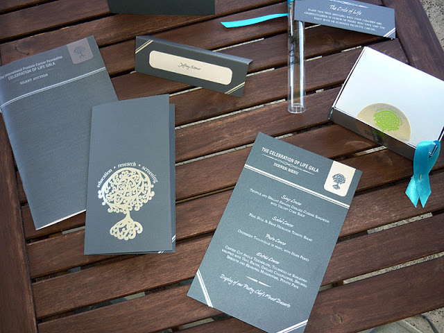
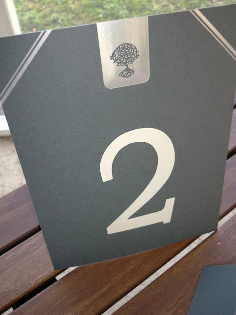
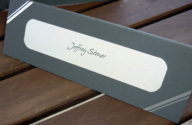
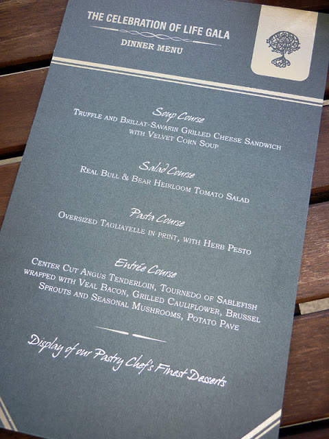
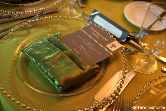
The first design decision was choosing a color palette. The monotone array of greys, silvers and charcoals really made for an elegant statement. I was able to incorporate the tree in a more formal way by using silver and white foil stamping on a Neenah classic linen charcoal paper for the programs, place cards and menu cards. The tree was used on the cover of the IPCF program as well as inside the program, that paired with a stripe corner border were the two design focal points of all the stationery pieces. All the items were classic and timeless and although appealing to the women's eye were designed with a masculine look in mind. We really wanted to keep it masculine so the materials suited the overall goals of the foundation in who they are reaching.
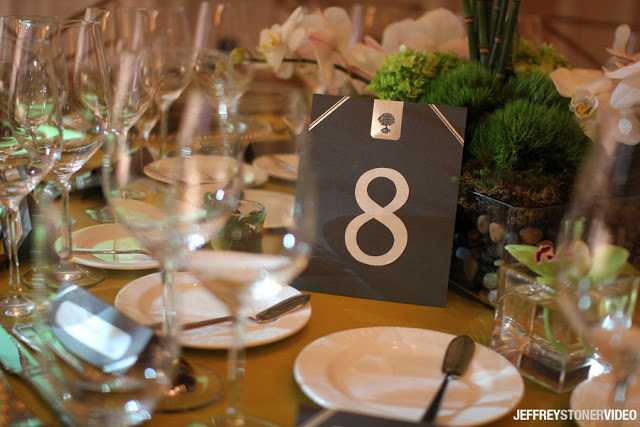
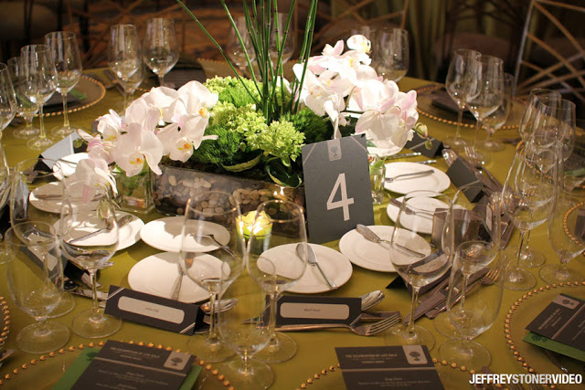
The design collaboration with Lisa Stoner of E Events really brought out the beauty of what we had created. The tables were dressed in green table linens, each had a lush floral centerpiece and clear glass gold beaded chargers. When menu cards, place cards and table numbers were placed on the tables, paired with the individual table pin-spotting the details of the pieces really came alive.
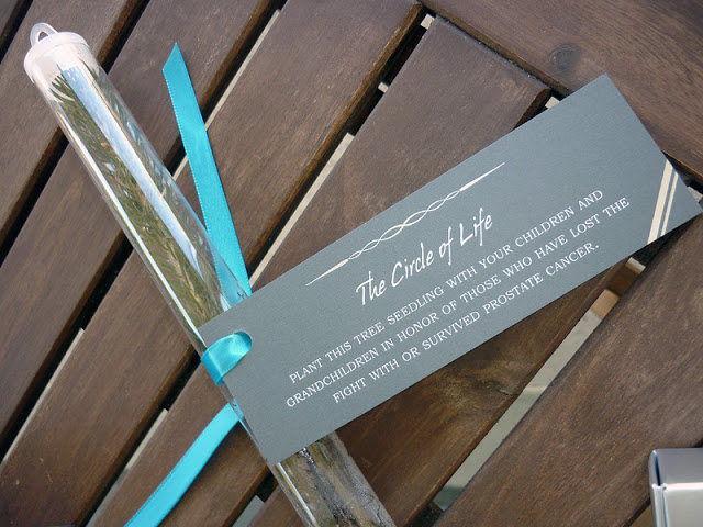
The grand finale of this event, like any were the favors. The foundation selected to hand out individual tree seedlings that each had a tag designed by The 2u Collection describing the meaning behind the seedling. Each guest was invited to take this seedling home and plant it in their own yard in honor of someone who has or is currently battling prostate cancer. This touch really put a memorable emphasis on why the tree was the focal point for the event and the foundation itself.
The event was one of the most rewarding I have ever had the opportunity to work on. Not only were both of my divisions contributors to the overall design and success of the event and the IPCF brand itself but I personally am continually touched by the efforts of Dr. Patel. I am honored to be part of the journey IPCF has begun and look forward to all the projects we work on together in the future!
Of course there are so many people involved in helping execute this, but I want to give so much thanks to Lawton Printers. Not only are they amazing at what they do, they treat their customers like family and will move heaven and earth (if needed) to turn my designs and ideas into beautifully printed finished pieces! Another big thanks to Jeffrey Stoner of Stoner Video for supplying all these beautiful images!
The average person does not know that prostate cancer is actually a genetic familial disease. That is why from the very beginning of the design process the tree was such a focal point. With the design of the Gala materials we wanted to keep the tree as a focal point, but obviously with any social gathering, items should look more formal and have a different aesthetic value than that of marketing collateral.
The first design decision was choosing a color palette. The monotone array of greys, silvers and charcoals really made for an elegant statement. I was able to incorporate the tree in a more formal way by using silver and white foil stamping on a Neenah classic linen charcoal paper for the programs, place cards and menu cards. The tree was used on the cover of the IPCF program as well as inside the program, that paired with a stripe corner border were the two design focal points of all the stationery pieces. All the items were classic and timeless and although appealing to the women's eye were designed with a masculine look in mind. We really wanted to keep it masculine so the materials suited the overall goals of the foundation in who they are reaching.


The grand finale of this event, like any were the favors. The foundation selected to hand out individual tree seedlings that each had a tag designed by The 2u Collection describing the meaning behind the seedling. Each guest was invited to take this seedling home and plant it in their own yard in honor of someone who has or is currently battling prostate cancer. This touch really put a memorable emphasis on why the tree was the focal point for the event and the foundation itself.
The event was one of the most rewarding I have ever had the opportunity to work on. Not only were both of my divisions contributors to the overall design and success of the event and the IPCF brand itself but I personally am continually touched by the efforts of Dr. Patel. I am honored to be part of the journey IPCF has begun and look forward to all the projects we work on together in the future!
Of course there are so many people involved in helping execute this, but I want to give so much thanks to Lawton Printers. Not only are they amazing at what they do, they treat their customers like family and will move heaven and earth (if needed) to turn my designs and ideas into beautifully printed finished pieces! Another big thanks to Jeffrey Stoner of Stoner Video for supplying all these beautiful images!

