2u Creative — Amy Morelli — Illustration — Branding — Graphic Design

Inspiration Series-The Color White.

AmyComment
So sometimes to get my creative juices flowing I create inspirations boards for things about the wedding I'm designing an invitation for. And in all this time I realized I've never been asked to create an invitation for an all white wedding, So I decided to take the party concept of White Party, and create and inspiration board for an all white wedding.


Martha Stewart's White Crudites 
(middle left) 
A jubilant symphony of pale crudites, including cauliflower, white asparagus, endive, and celery, is arranged in a triangular dish.


Martha Stewart's 
White Petits Fours 
(middle left) 
Heart-shaped petits fours are decorated with Darcy's and Andy's initials. "It was a way of making it more special for Darcy," says Jenny of the many personal touches.

photos by Johnny Miller/Martha Stewart Weddings

(top right) 
amazing, white on white on white floral!


dress by Vera Wang

(middle center)


photos Martha Stewart Weddings

(middle right) 
love the idea of the guests wrapping their gifts in white, what great photography it would make.


photos courtesy of Brooklyn Bride

(bottom left) 
NYC Loft all white, with all white furniture.. So elegant!


dress by Maggie Austin Cake

(bottom right)


Vintage 1930s bridal shower with a Modern Twist.

AmyComment
I am kind of a chameleon when it comes to genre of style. My fashion sense is one style, the decor in my house another, and my stationery work-- well that changes depending on the mood I'm in, client I'm working with, and the influences around me at that time.


For example, a few summers ago I took a trip to the New England Area for a wedding (a family affair, non work related). While there I got to visit Yale, New York City and Newport Rhode Island. Something pretty cool in Newport Rhode Island, you can go on a tour of Some of the most amazing Mansions. There are 11 Mansions, several of them owned by the Vanderbilts in the 1800s.  When touring these mansions the over the top opulence and decor dripping in gold just screamed out at the creative side of me. I've held on to these images, of the beautiful hand workmanship and ingenious devices in these homes, for the last few years, dying to create and invitation with the inspiration of what I saw there and idea of parties with formality, style, etiquette and flair.

This as you can imagine isn't a huge request, so I had to wait for the right client, the right collaboration.  This year it happened! A wonderful sister of the bride, came to me with an idea for a shower she wanted to throw for her sister. The first thing she said was: My sister is an old soul and I want to throw a shower that is very 1930s, white gloves and fancy hats. I was so excited by this. So I got right to work, and the imagery that immediately popped into my head was the opulent, detailed decor and hand painted details I had seen in some of those 18th & 19th century mansions. The colors I chose, as well as the textures and materials all came as inspiration from the decor in these opulent mansions in Newport, and the stories of the formality and etiquette of their social calendars.

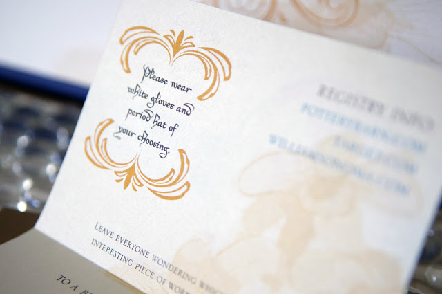
I hope you enjoy the result. The bride and sister of the bride were in love with these invitations and favors. And from what I was told, they were a big hit with the guests! Also a fun thing, the invite requested guest where a period hat of their choosing along with the gloves included in the box!

 
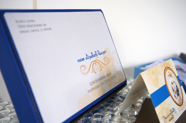
Shipping Box for the invitation.

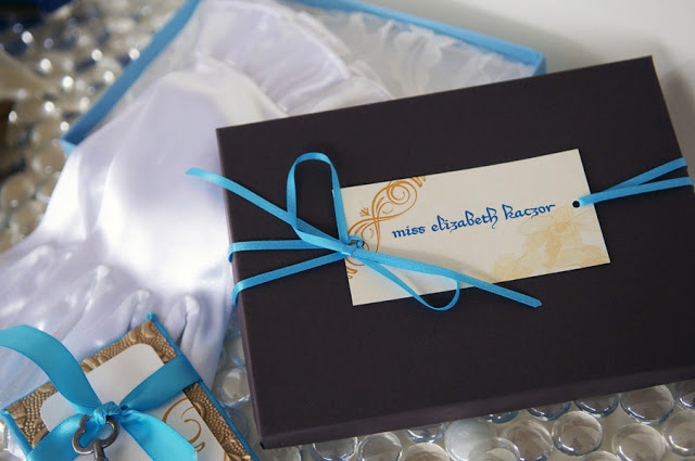
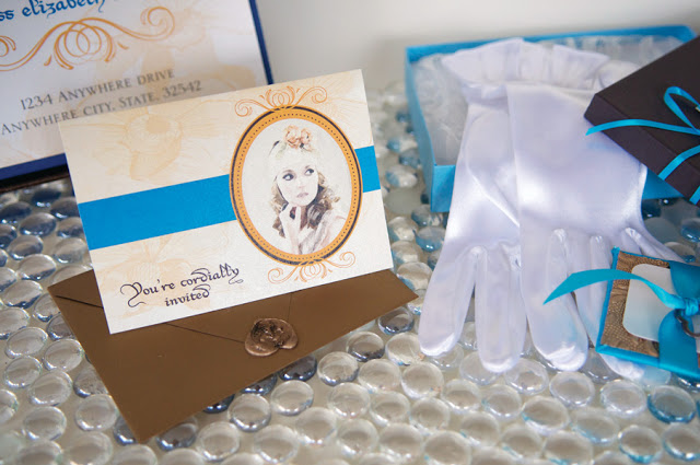
Chocolate and Blue Box for the invitation. It was lined with lace, and included white satin gloves and a bronze metallic envelope closed with a wax seal.

Invitation on Champagne Metallic Paper- graphics and font chosen for their victorian formal attributes.

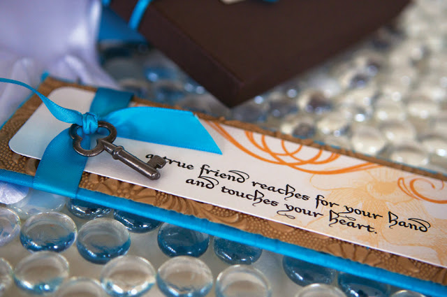
Finally, the favor we created for the shower. The bride loves to read, so we created these silk wrapped bookmarks with embossed metallic gold paper and an antique key tied with satin ribbon.


Letterpress... Yes Yes!!!!! Part II

Amy2 Comments
Read Part I

I am so excited about this project, we have been giving you bits and pieces as we complete them.  We still have the reception stationery in the making, but I'm so in love with some of this stuff that I can't wait to share! I love love love texture, and anytime I can use textured materials, I jump at it! Plus, this bride has been hands on in the design process, which is adds collaboration, which is always fun for me.


What the bride had to say
The invites look amazing and we are getting so many compliments!!  Many people are saying that they are the nicest invites they have ever seen."

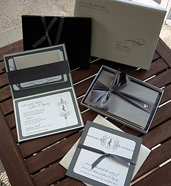
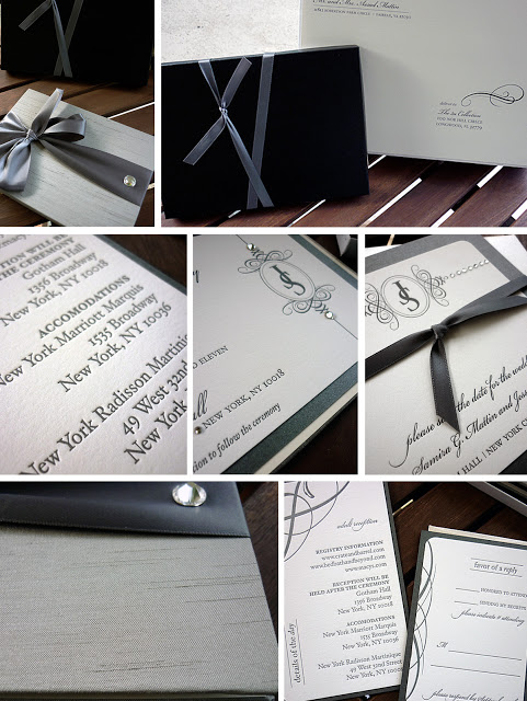
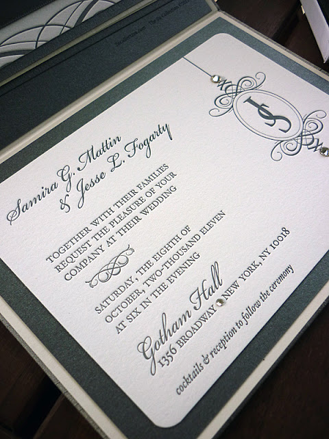
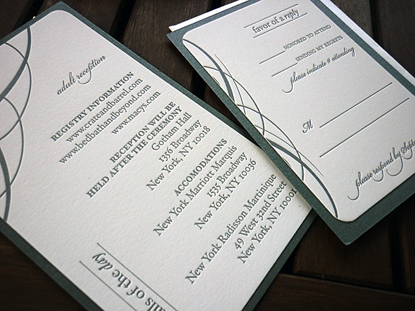
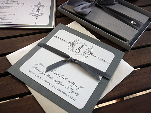
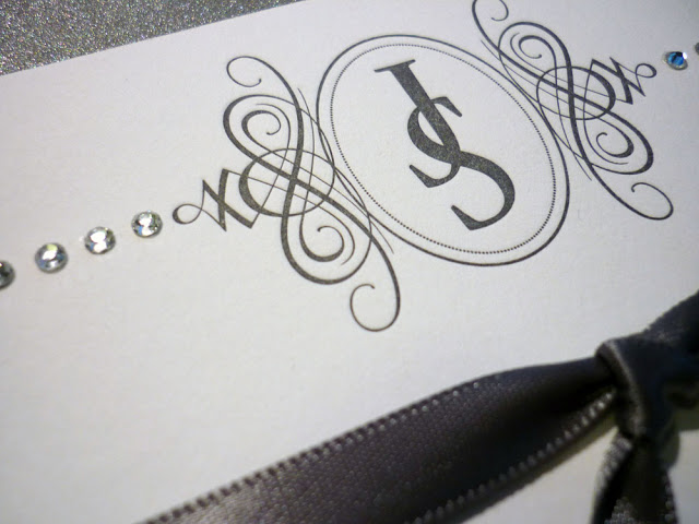
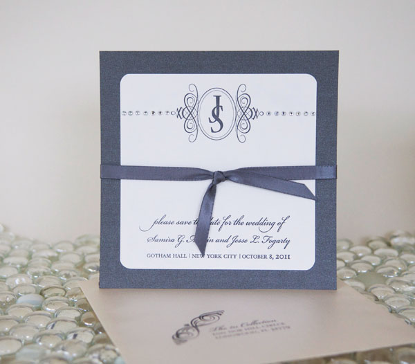
Pictured above: Letterpress, Silk Hardbound Book Invitation and Save the Date, with Satin Ribbon and Crystal Embellishments. The way the textures and design compliment each other creates a sophisticated, stylish and modern invitation with a traditional flair. 

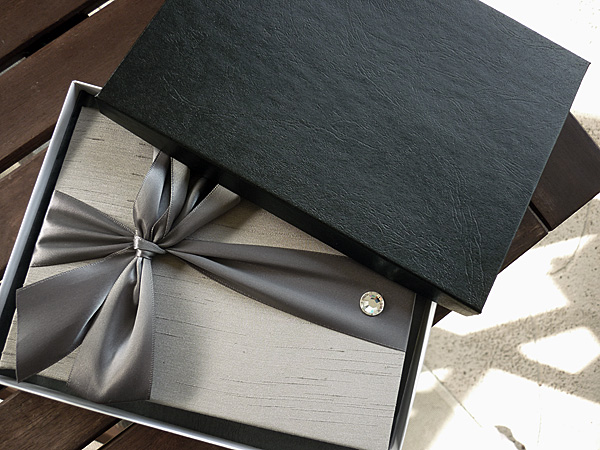
 Silk Hardbound Book mailed in a shipping box and presented in a leatherette box lined with pewter tissue paper. (See top right of collage). Remember Brides, when you sent something this extravagant, you must allow for the additional postage, and packaging in your budget. This is something most brides don't consider when sending boxes.


 Inside of the silk book. Pewter Metallic Paper Inlayed with Felt Letterpress. Accented with Swarovski Crystals. Below Detail cards.

 Front of Silk Book, with Satin Ribbon accented with a Swarovski Crystal, presented in a Pewter Metallic Tissue Paper Line Leatherette Box.


 Matching Save the Date. Was Blogged about in Part I.


Letterpress production by Mama Sauce!!

Inspiration Series-Maggie Austin Cake!

AmyComment
I am often asked how I fight through creative block and what inspires me. So, I've decided to write an Inspiration Series each week I will try to write a few things about what inspires me.


I've found that sometimes to break out of a NON-creative funk, it's best I go look at some work of other artists I admire. Being a traditional artist as well, It's fun for me to see what other artists use as their outlet, although I paint, and sketch my primary outlet for my art is through graphics, type and paper.  Sometimes to see how other creative minds put out their ideas, and the creations they create will jostle my own creative juices.


So today I want to share with you, one of my favorite places to go and be inspired. Maggie Austin Cake. Her cakes are amazing, and I am so excited to share her with you.

She can make a gorgeous- SIMPLE white cake. And I'm sure as simple as they may look, they probably come from a complex design production process.


And use texture, like I've never seen before. Anyone who knows me will tell you that I LOVE LOVE LOVE texture, and Maggie Austin Cake is AMAZING at use of Texture.


 Hand-Painted Goodness!!  OH MY!! I love love love this hand painting work. This is so inspiring to me, because although I am a trained traditional artist, sometimes I get caught up in the graphic side of things, and forget that I have the hand talent to incorporate into my work. These cakes remind me that hand painting is GORGEOUS!!!


Here use of Bright Bold Colors is inspires me to think outside the box! Especially when I get 4 brides in the same season with the same color palette!


And look at these amazing details. Pieces of sculpture in their own right.


And finally, she makes these AMAZING hand painted cookie.. In the painted styles of traditional art. Impressionist, Bauhaus, Art Nouveau and Botanical.


Platinum & Pearls!!

AmyComment
Every year there is a color combination that stands out of the trend of the year.. This year PLATINUM!!!  I have had several brides using Platinum/Pewter as the main color in their wedding. From Invitations to Flowers & Centerpieces, this is the color of 2011-2012 Planning season.


With that in mind, I wanted to start blogging some of the favorite invitation creations coming out of my studio this year using Platinum as the main color!  Today let's talk Platinum & Pearls.


This invitation set was fun to create, and since I was designing for 2 other brides with Platinum as well, it was quite the challenge! I decided to give this set it's own unique flair by adding pearls and feathers!  Platinum Metallic Paper with the invitation inset printed on White Linen,  the contrast of sparkle and texture really makes this invitation pop! Of course the Satin White Ribbon, White Pearls and Feathers really bring the concept home! The bride added splashes of Wine to set her apart.


Paper Rings WHAT?!* These are AMAZING..

Amy1 Comment
Artist Yael Friedman carefully crafts these gorgeous rings from PAPER! 11 designs in all. Each is unique, hand folded, and available at Moss in NYC.


Anyone who knows me, knows I have a slight Paper OBSESSION.. Okay, and those of you who know me, know-- it's not slight.. It's MAJOR. I love paper textures, handmade papers, and pretty much anything unique and different you can do with paper. So on that note I had to post these, they blew my mind.

Letterpress...YES YES!!

AmyComment


So today I wanted to talk a little bit about preserving our past. I know in the world of technology, it is all to easy move quickly forward leaving the things of the past behind us without another thought. With the newest latest and greatest coming out every 3-6 months it seems it is easy to get wrapped up in race for better, faster, quicker. 


Today I wanted to write and implore you all DON'T JUST ABANDON ALL OF THE AMAZING THINGS from the past. For example, how many photographers do you know still shoot film? How many artists still hand render their artwork? How much printing is still done on a manual press? These things are dying arts, and it breaks my heart to see some amazing processes thrown to the wind, because now a computer does it faster.  Don't get me wrong, I love the newest technology like the rest of you, but I think balance is the key.


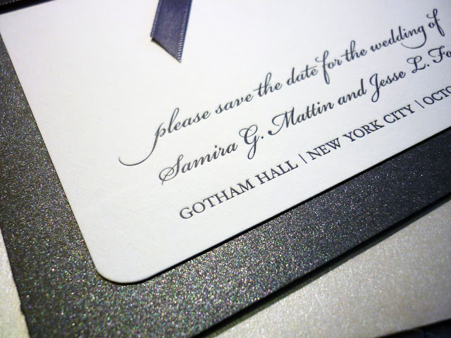
Film grain and hand drawing, printing, and finishing can be beautiful, adding texture and flare to your project. With that in mind, I created these great LETTERPRESS Save the Dates, with Crystals and Ribbon done by Hand.


What is Letterpress printing? Relief printing of text and image using a press with a "type-high bed" printing press and movable type, in which a reversed, raised surface is inked and then pressed into a sheet of paper to obtain a positive right-reading image. It was the normal form of printing text from its invention by Johannes Gutenberg in the mid-15th century until the 19th century and remained in wide use for books and other uses until the second half of the 20th century. 
I know this is probably a little technical for some of you, so a brief summary is: Plates are created, inked and PRESSED into the paper, creating a beautiful impression of the design into the paper. See the image below!


We are lucky in Orlando to have a company that is MASTERFUL at letterpress production!  Mama Sauce!! We are working together on this current project, stay tuned later in the fall to see the full package for this wedding!


Announce Your Bundle of Joy in Style!

AmyComment
Custom Baby Announcements!! all studio product photography by Liga Photography


This is a fun way to announce your bundle of joy in style.  Your friends and family will be WOWed, with this Magnet Closing Accordion Book..  Both Ends have magnets in the covers so the piece- stay closed.  


I did this announcement for my niece Gracie's birth, in 2010. I did a small mention of them when I announced her birth last year, but here are a few more details.

Metallic Photo Paper Hardbound Magnet Covers

Pearl UB Gloss Paper inside, with all the details of her entrance into the world.


Added detail: I took an image of her, turned it into a sketch and used it on the envelope. It really wowed all who received it in the mail.


Weddings Unveiled Save the Date Contest

Amy1 Comment
Last march we were asked to collaborate with Weddings Unveiled Magazine and provide a contest for their faithful readers! Kirstin at Weddings Unveiled, posted the contest on their blog, Completely Unveiled.


I have been so excited to post these, because they are one of my all time favorites! But I wanted to wait until the Bride and Groom sent them out, as to not ruin the surprise for their guests. But finally the time as arrived. 


What the bride and groom had to say
"The Save The Dates are perfect. You were able to capture the theme and feeling of our wedding. Our guests haven't stopped talking about them and now they are even more excited about what's to come."


Andrea & Eric


The Die Cut is what makes this so amazing! Andrea came to me with a anthropology-esque theme for here wedding. I was so excited and this is the creation. We used Gold Linen Metallic Paper, an Ivory Satin Ribbon, which all complimented the Champagne Die Cut with Gloss UV Coating!  


I'm in LOVE with it.


Please comment and tell us what you think!!


Guest Blog by Anna Cakes!

Amy6 Comments
So anyone who knows me knows. I LOVE LOVE LOVE cake.. And it's not really that I like eating cake, I don't have much of a sweet tooth, but I am obsessed with Cake Design. It has really come along way from throwing eggs and flour together and putting the mix in a round pan.


So on that note, I asked the Amazing Anna Hightower of Anna Cakes to Guest Blog on some of the hottest trends in cakes! See her at work below! And read her thoughts on some of the hottest trends in cakes! (PS ALL CAKES ARE ANNAS WORK-- if you are a photographer and you haven't been credited I apologize, please comment and I'll make sure I make the proper edits to give you credit!!)


THE SIMPLE MESSY WHITE 
I have to say this is quickly becoming one of my favorite designs! Letting the spatula marks fall as they may, this unpretentiously-iced cake is the epitome of simple elegance. No fuss, no fondant...just tiers of delicious buttercream frosting, and a few fresh flowers are all you need to make this design pop!

PS..if you are into the simple white cake without the messy spatula marks- check out this cake below.


MIMICKING ARCHITECTURE 
Modern cakes are getting daring in both shape and composition. We have gotten a lot of requests lately for a particular cake that is comprised of various sized square tiers, stacked in a way that almost seems to defy gravity! Guests are amazed by these intricate wedding cake "structures". It becomes the focal point of the entire reception.

OUT OF THE BOX CAKE TOPPERS
I always say I am going to start an album on my site called, "When bad toppers happen to good cakes." LOL. A topper can definitely make or break a wedding cake. I have arrived at a venue on several occasions and been so disappointed when I saw the topper awaiting me on the cake table. I try to encourage brides to choose something unique. It doesn't always have to be a made-for-cake topper. Veils, Brooches, hand-made paper or clay crafts, even a photo of the couple can be used to make a statement. Your cake topper can become an amazing keepsake from the wedding itself, and possibly even a family heirloom! 

BE DARING WITH FLAVORS
Gone is the standard white wedding cake. My motto with flavors is anything goes! I offer a different flavor for each tier, at no extra cost, so my clients really feel free to be creative. Try coconut cake with guava filling for the top tier. Mix it up with a lemon and pineapple middle tier, and top it off with a devil's food chocolate cake, with peanut butter buttercream filling for the bottom. Your guests will rave about your cake flavors for years to come.

RETRO COLOR AND TEXTURE
Lately you see a lot of bridal magazines boasting the retro-modern wedding cake. These cakes typically have bright colors, and play up on the graphic patterns -- circles, rings, repeated diamonds or triangles. Think wallpaper and textiles -- you can find amazing wedding cake inspiration in the prints and patterns all around you!  

BRIGHT COLORS WITH BOLD TEXTURES
I really enjoy when a wedding theme lends itself to a bright, colorful wedding cake. It is exciting to get out of the routine of white on white on white, and mix it up with color and texture. Sculpted rosettes, mimicking fabrics, different colors for each tier -- as long as you have a repeating element with each layer, the cake will have a cohesive, tasteful look, while still being adventurous. 

CUPCAKES MASQUERADING AS WEDDING CAKES
The cupcake tower is a popular trend with a dual purpose. Not only is it more cost effective than your average wedding cake, but it also saves your caterer loads of cake cutting/serving time. Depending on the venue, this can also save you the dreaded "cake cutting fee". Cupcakes are a hip new craze that add a light-heartedness to your reception. Nothing gets your guests more excited than walking by and smelling that vanilla frosting cloud that surrounds the cupcake display. Just make sure they wait until after cake cutting to help themselves!

HAND PAINTED CAKES

Hand-painted cakes add an extra special touch to your wedding. Although you will be limited on your icing choice, as this is a technique that can only be achieved with fondant-covered cakes. Not every bakery can produce this level of art work, so be sure and review portfolios and choose wisely. This technique requires quite a bit of time and detail, so the cost is reflective...but the impact is worth every penny! 


I hope you enjoyed this blog! I know I did, and a special thanks to Anna Hightower of Anna Cakes for her time and effort to help us put this together.

Our Ready Made Line is all grown Up! Paper Couture Stationery Official Launch!!

AmyComment


So many of you know we did a soft launch earlier this year in January. But last night was our official launch..  Now that we worked out the brand and figured out the look and feel, it was time to give it a proper party! We want to thank everyone who attending and of course, special thanks to Alexandra Calvet and Cristina Calvet Harrold of CCH Weddings for throwing us this fabulous party.. If you missed it, check out the slide show below!! We are so thankful and proud of this Stationery Line, and love sharing it with you!


Favorite Trends! Guest Blog Collaboration.

Amy2 Comments
This is something I've been wanting to blog about for a while, but I knew if I was left to my own devices it would be about stationery ONLY!! So, I enlisted the help of Alexandra Calvet from CCH Weddings to collaborate with me and below are some of our favorite trends happening this year!
Thanks to all who contributed! And thanks to Alex for helping me put this together!


1. KEEP IT CLASSY A classic staple has made its way into the modern weddings of today. GREY is the New Black. Grooms are opting for change, gone is the traditional black tux. Also Bow ties are making a come back to replace the tie. Bow ties come in an array of colors and patterns, which the groomsmen will enjoy picking. Mixing and Matching different bow ties for the groomsmen is also adding some artistic flair to the grooms style.  photography by: Elizabeth Leighton Photography  2.THE NON-TRADITIONAL CENTERPIECE Some interesting tablescapes are breaking through this year. It's all about shaking up the traditional. A lot of Floral Designers are working with brides to create unified variety. Creating a few different UNIQUE Centerpieces and putting them throughout the reception. This way each table has it's own unique style, and your reception is filled with variety! photography by: Liga Photography — floral by Avant-Gardensplanning & design by Jennifer Schwatz with Anje Soirees   3. ICE COLD Candy bars are on their way out and ice cream bars are coming in! Martini glasses, ice cream cones and gourmet ice cream, you can’t go wrong with this fun idea. Instead of putting candy in a bag, you can now use it as a topping on your yummy ice cream. photography by Jeff Hawkins Photography 4. COLOR YOUR GOWN GORGEOUS Vera Wang’s new 2012 collection is full of color! Brides are getting away from the traditional white and choosing blush colors with lots of texture. If colors are too bold for you, PLATINUM is the new black! It's every, it's chic and classic. 5. BALLOONS AREN'T JUST FOR BIRTHDAY PARTIES ANYMORE Martha Stewart Weddings  just featured this wedding with this simple modern design. One thing that stood out to me, was how they used these white classic balloons for the centerpiece and table numbers. BRILLIANT!  What a classically modern way to handle balloons. Be careful- using this trend could lead you down the 5th Grader Birthday Party Look, but if you use the image above as a guide, you can't go wrong! 6. BRIGHT BOLD COLORS This floral from OnceWed shows that brides aren't afraid to take risks this year! The brighter, the bolder, the better! 7. SIMPLE ARTISTIC STATMENTS Cakes this year seem to be dialing down. I LOVE IT.. This Simple Understated, yet IMPACTFUL cake from Maggie Austin Cake will blow your guests away. Simple does NOT mean boring, and this cake just proves it. 8. SMALL BITES Keep your guest dancing the night away by ditching the sit down dinner. This year weddings will take a modern twist on catering. RSVP reply cards with food preference will not be needed because heavy bite sized hors d’oeuvres are the new trend to keep guests full, yet light on their feet!  photography by: Liga Photography

From the Vault!

AmyComment
We keep busy around here, and I don't always get to blog every project that I design, so everynow and then I like to pull a favorite design from the vault and share!  


This one, I LOVE because it's fun, funky yet still formal. A while back Solutions Bridal Designer House moved their Orlando Location to the The Mall at Millenia Area. We were so honored to be asked to create the invitations for their grand opening event!! This was the result, they were a big hit, and I am a little biased, but this is one of my favorite projects.. (I know I say that about them all.. I'm HOPELESS!!)


For this project we did Bar Signage, Sponsorship Tins, and of course Invitations!


Fun, funky and Chic at The Ritz!! Part II

AmyComment
Read Part I


all studio product photography by Liga Photography
all wedding and venue photography by Thom Larussa
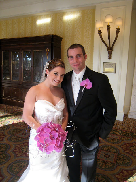
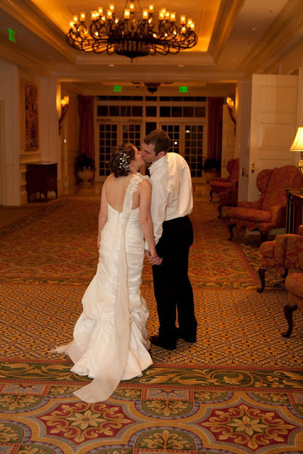
Couple Vicky and Danny, happy on the day!

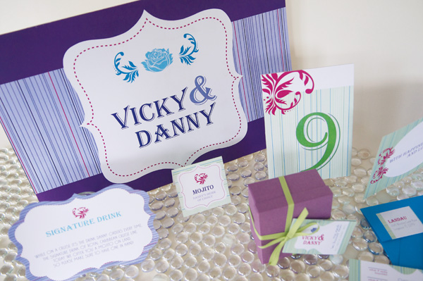
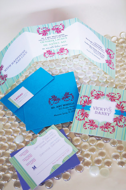
I hope you enjoyed part one, Save the Dates and Invitations out of the way, it was time to get down to it and create an amazing stationery package that would gracefully yet boldly work into the event design. From Flower Structures by Lee Forrest to the overall event design by Lisa Stoner of E-Events, it was a challenging and fun task! 

Tell us what you think, how did we do?

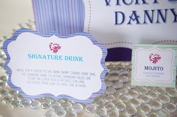
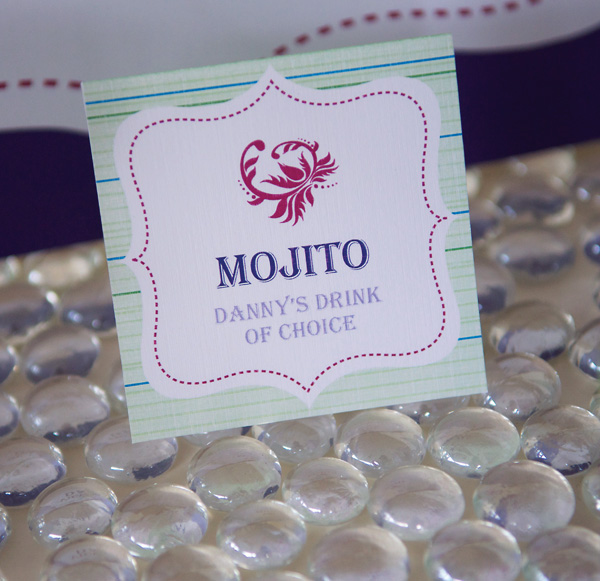
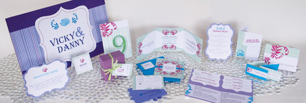
One of the unique things about this wedding was they did all kinds of personal things, and had little areas of  flower structures and defined areas! This I always love, so it was fun that I got to create all kinds of signage for the event, from tray passed drink cards, to bar signage and escort table signage! Check out all these pieces in their environment at the reception!


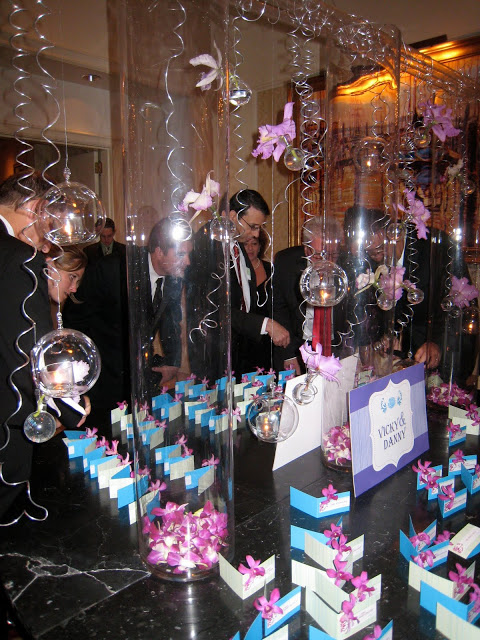
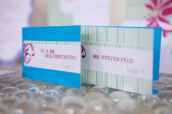
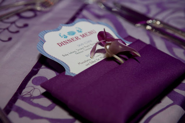
The Escort Card table was one of my favorite things, as you can see Lee Forrest did an amazing job above, and my signage worked right in and another great little touch was we added a orchid blossom to each escort card, which rotated between 2 designs (see below in studio)


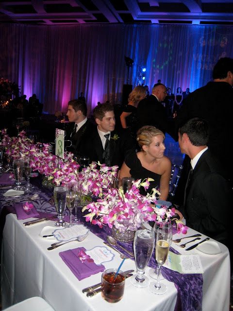
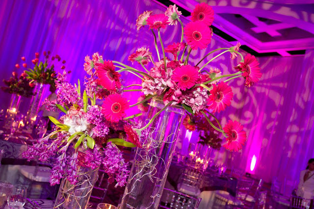
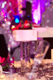
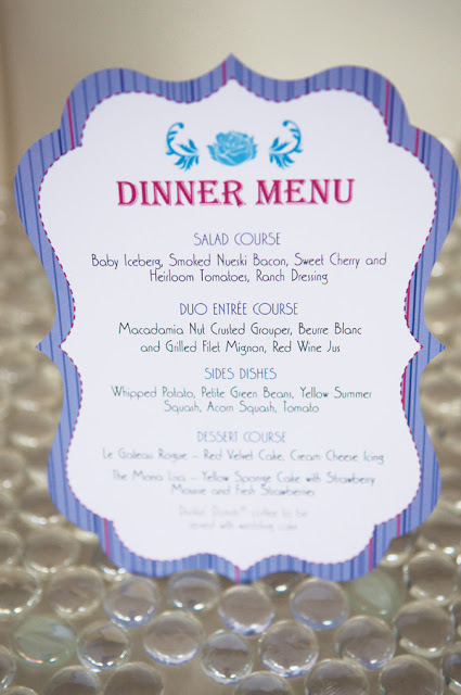
Tables look amazing! Props to both Lisa and Lee! Loving the Table numbers worked into the flowers! And you can see a peek of the menu, see detail shots below. Also note, the gorgeous centerpieces (by Lee) below, as well as the cooliest cake ever by The Ritz Carlton Grande Lakes Orlando!


LOVED the die cutting of these.. It was such a fun way to incorporate the original graphic shape from the invitations.  They really work well, with the orchids and linens below!


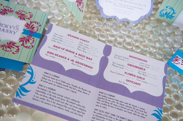
Oops, and I can't believe I forgot to mention the Programs. Vicky and Danny educated their guests on the traditions incorporated into their wedding ceremony.


Here's what Vicky had to say after it was all said and done!
Amy did an excellent job transforming my unconventional invitation requests into amazing pieces of art. Her work is truly spectacular and one of a kind.


Fun, funky and Chic at The Ritz!! Part I

AmyComment
all studio product photography by Liga Photography
all wedding and venue photography by Thom Larussa

This Spring I got to be a part of something wonderful! One of my most fun brides with her own unique style and flare.  So take this journey with me. There are so many wonderful things to say about this wedding, this project, and many of the other amazing vendors that came together to create what you are about to see, that it's a 2-PARTER!  


This couple was fun, and the with the collaboration that happened from the very beginning I knew this was going to be a fun interactive process. From the Mother of the Bride, to Lisa Stoner  from E-Events Design to Floral Designer Lee Forrest Collaboration was in the air!


Cute Couple Vicky and Danny!

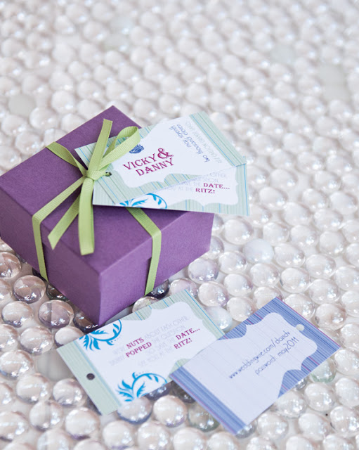
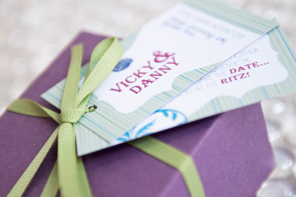
 Unique Save the Date! Vicky came to me with this great poem. 
"We are NUTS about each other.
Danny POPPED THE QUESTION,
So save the DATE,
See You at the RITZ"


So I designed this cute little box with the poem and wedding date on the tags! A great treats 
for the guests, it contained the food from the poem, Nuts, Popcorn,Dates and mini-Ritz.  
The guested loved it..

Here's what Vicky's mom had to say after they went out!
2uCollection was an integral part of my daughter's beautiful wedding. It started with the Save the Dates and continued all the way through the end. The Save the Date Announcements and Wedding Invitations were so incredibly unique. I kept a log of the reactions that people shared with me. Never had they ever seen anything so clever and beautiful. It continued with the Wedding Programs which matched the invites which matched the save the dates. The dinner menu and dinner escort cards were something I have never seen before. The table numbers matched the invitations. The entire package was amazing and I would recommend 2uCollection anytime. I know we plan on using them again for our next child's wedding. Loved, loved, loved, their work. Thanks Amy!!!!

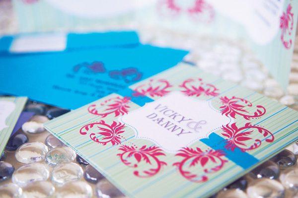
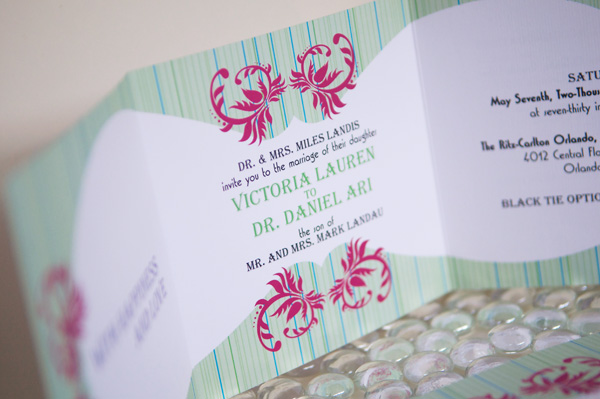
The fun continues! Linen Paper made this design POP! The Bright Bold Colors really fit this couple! Wait until you see some of the great design by Lisa, at the reception. See the details below.


STAY TUNED Part II posts on Saturday Morning!


The Year of Purple! How to stay unique with the same color palette?

AmyComment

all product photography by Liga Photography
Most wedding vendors can tell you what the hot colors of each year were! Because we do so many weddings and get to see the work of some many of our talented peers, we can see the trends for each year.


The 2009/2010 wedding season for me and my clients was what I refer to as the "Year of Purple".
I get asked alot how do I create unique, and different designs for each client when their themes, or wedding designs are similar. Well I'm not going to lie, it can be difficult sometimes. As a creative brain, sometimes when you are dealing with the same themes and colors, it can put your ideas "In a box."  But as wedding professionals it is our job to not let that box, limit the creative process.  A good tip to break out of your box, take an element from each bride that is personal to them, what is most important to them for their wedding, is it the dress, is it the floral or design element, is it a personal family tradition? These will sometimes help you focus on this bride, this wedding, instead of getting stuck in designing around the color palette.


So I wanted to share with you some of the beautiful invitation designs from the "Year of Purple" and get your opinion.  What do you think? Did I do it? Does each piece feel different and unique to the client it was for?


This bride was opulent and traditional. Her ideas were to create an over the top luxurious wedding with all the formality of kings and queens. So our idea was to add this amazing Ice Blue paper to the design to break up the patterns and the purple.  And of course satin and crystals were used to add the air of luxury.


This bride wanted her wedding to be romantic and moody. She got married in the late evening in a dark room with the dramatic lighting of hundreds of candles. Creating a gorgeous romantic intimate feel.


This bride was getting married in the spring in a castle in upstate New York. This was by the far the thing she seemed most excited about for her wedding. She wanted light and airy with an elegant tone. So when designing I focused on the castle, we used old world elements in the design. Candelabra's, Quill Pens and lace.


This bride's favorite element of her wedding was the dress. She was so excited about the dress it was the first thing she showed me. Her wedding was to take place outdoors in the evening. But she didn't want the outdoor setting to be limiting. She wanted to bring formality and elegance to the outdoors.  This was done by hanging chandeliers and crystals from the trees at her location.
So we designed these invitations around the dress, that had a perfect balance of lace, floral, satin and crystals in creams and subtle hints of silver.  


A Sneek Peak of what we are Currently Working on..
AmyComment
Okay I know it's been a while.. I'm ashamed. But it is wedding season and we have been busy giving our absolute best to our current brides and their weddings!!  We try our best to give the attention deserved to each event and sometimes that means I fall behind on catching up with all of you wonderful readers.  


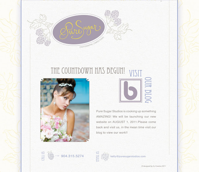
But Wedding Season does NOT mean work stops in our other division 2u Creative!!  So, I wanted to give you a sneak peak of what we are working on.  Earlier in April we were happy to welcome Kelleen Hite of Pure Sugar Studios as a client! She loved all the brand development (to view this see below for links to past blogs) I've done for Abby Liga of Liga Photography. and wants me to re-brand her!! Thanks Images for a Cure Workshop for letting Abby RAVE about me in her Workshop!


So we've been busy working on getting her new website up!!  Below is the Teaser Coming soon page we've created.. and I also wanted to share the custom icons we illustrated for the site.. 


Stay tuned we hope to launch her new site by August 1st, and we will be sure to announce it when we do!!


Please comment and let us know what you think so far!!


This is the Current Teaser page up at PureSugarStudios.com


Custom icons we illustrated for the site. Please comment and let us know what you think!


Links to see the branding work we've done for Abby Liga.  and PS.. an updated look is in the works for her as well!! Her website is done in the new look, and we are working on a NEW Editorial Magazine Style Brochure, you can see a sneak peak of the new look on the first link below.


A New Look for Liga!
The Liga District.
Look What we Accomplished!
Lawton's Printer, The Liga District and 2u Collection Successful Collaboration!


Interested in Branding and Why its so important?  Check out these previous posts on the subject!

The Importance of Branding & Advertising- PART I